RSA - BeYOUtiful in your skin

The name of this project is called BeYOUtiful in your skin, it is an interactive self help to boost self-esteem in 16- 25- year- olds. The brief for this project was one of the RSA briefs I chose a brief called in my skin because I felt that I could relate to it in some type of way. The brief talks about how everyone should feel confident, safe, and able to celebrate their skin. It talks about how skin confidence and inclusivity is a challenge that spans generations. It took me some time to think about what I could create for this brief so that did cut my time down but after reading the brief over and highlighting words and phrases. Skin confidence stuck out to me; I thought about and research ways that 16-25- year- olds work on their skin confidence and decided to do a self-help book. The effective of social media is also mentioned in the brief, “all led to increased feeling of depression, anxiety, poor body image and loneliness.” I made the decision to make sure my idea would not involve social media.
Next, I worked on my research, I researched why books were important, why do people still buy books to get an understanding about books and the people who buy them. One of the reasons why books are important is because they have the power to transport us to a different world. This is exactly I want my book to do, I want to create a safe space for the reader to get know themselves, to learn new things about themselves and to have fun while doing so. People still by books because they are tangible, nostalgic, reminder of childhood reading. I came across a website where people were having a conversation about why physical books are better than e-books, someone made a point that physical books are better because you can make notes in them. This made me think about how books a written by one person but interpreted differently by everyone, so people usually like to write on the pages to create their own understanding and almost in a way personalize their copy. This inspired me to have book have a very plain and simple design so that the reader could personalize the book how they would like.
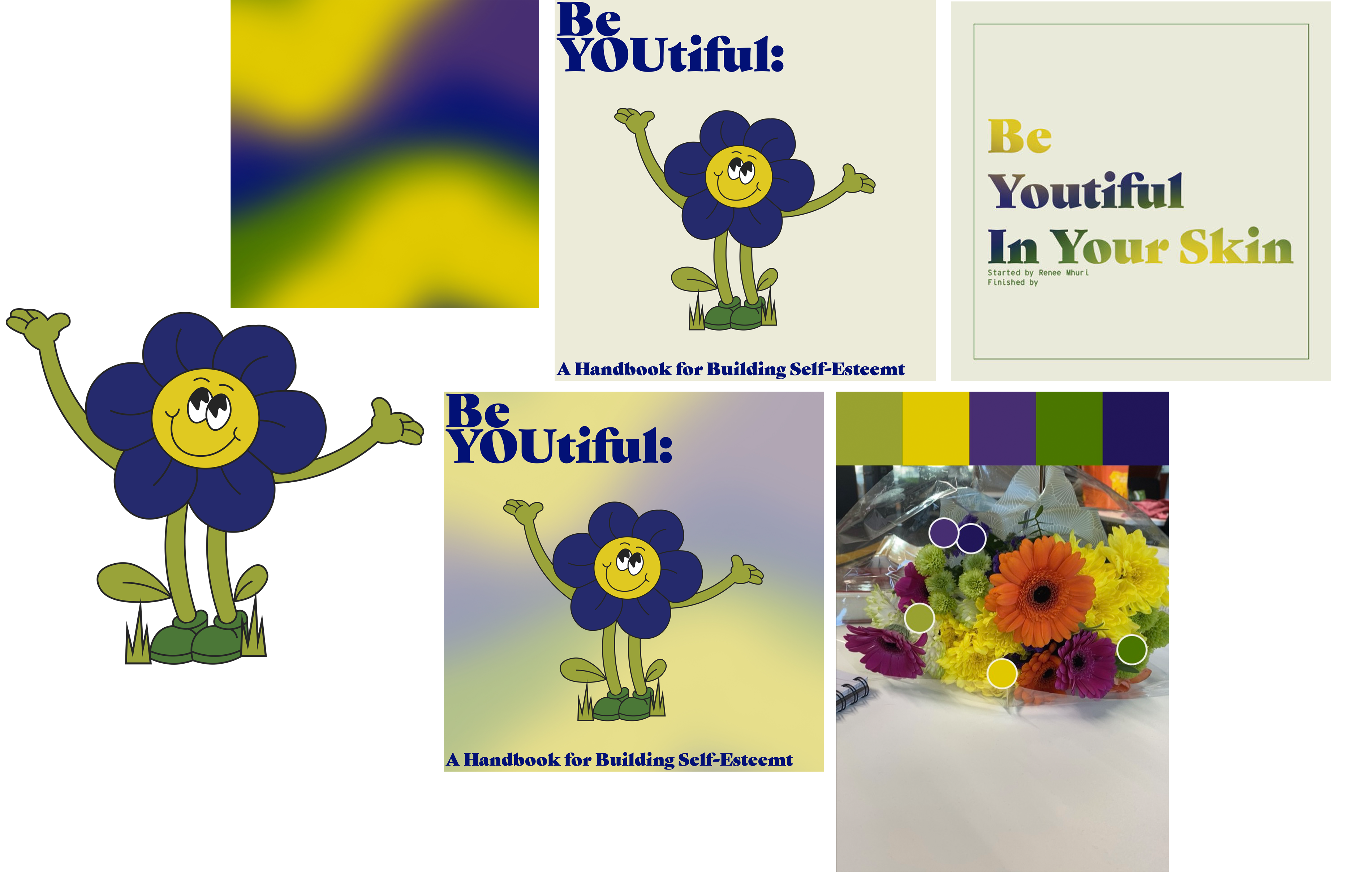
I researched colour psychology to understand what the different colours mean and how the brain reads them so I could choose the colour scheme for the book. Yellow is the colour of mind intellect. Green represents growth, self-reliance, and healing. Blue represents peace, is calming and creates a sensation of space. Purple represents imagination and has an introspective ton which allows us to connect with our deeper thoughts.
I downloaded some popular self-help apps to see if I could transfer some of these design and content ideas to my book. A lot of them used similar colour schemes blue, purple and orange. Calm had a lot of bedtime storytelling, it is more of a mindfulness app. Head space had mediation, breathing exercises, sleep guides, music, workouts, and podcasts.
The last bit of research I did was on self-esteem, body image, identity and personal expressional. I also researched the psychology behind journaling, affirmations, and other mindfulness exercises to include in the book.
I next started to design the book, I had to keep in mind that my target audience was people of all gender types, the psychology of colours and the fact I wanted the book design to be plain and simple so that the book could be personalised by the reader. This fuelled my decision to make the beiges beige instead of white, I also felt that white was to bright a colour I needed something a little dull. The colour beige shows a desire for comfort and neutrality. I found a bouquet of flowers and decide to use the adobe colour app to get the colour codes of the flowers to use for the book. I really loved these colours because they weren’t too loud and bright, they were perfectly muted and matched up to the requirements of the design scheme. The design I had chosen before my final was too bright and the flower character, I had designed was too childlike, so I scraped it and stuck to the colours. I then had the idea to create simple illustrations that were close to the colour of the page to have the page with the writing not be to boring.
I feel that the outcome of this project could have done a lot better if I had managed my time. The research, my concept, and the content I planned to add to the book was the part that went well. Think what I created was polished work but If I had managed my time, I could have created the book that I wanted and finished it. My research was probably the strongest part of the project I went in really deep I don’t think I could have done more or anything ton fix this. The design concept was clean it fits the requirements I had set for myself which were my target audience 16-25 year olds, the colour psychology and the fact that I wanted the book to be plain and simple so that the reader could immerse themselves in the book learn about themselves and star their journey of self-discovery. Another thing I think that I could have done better is involve the In My Skin aspect of the brief, Throughout this project I can see that I started to lose sight of the main part of the brief.