Project 2: Sippet -
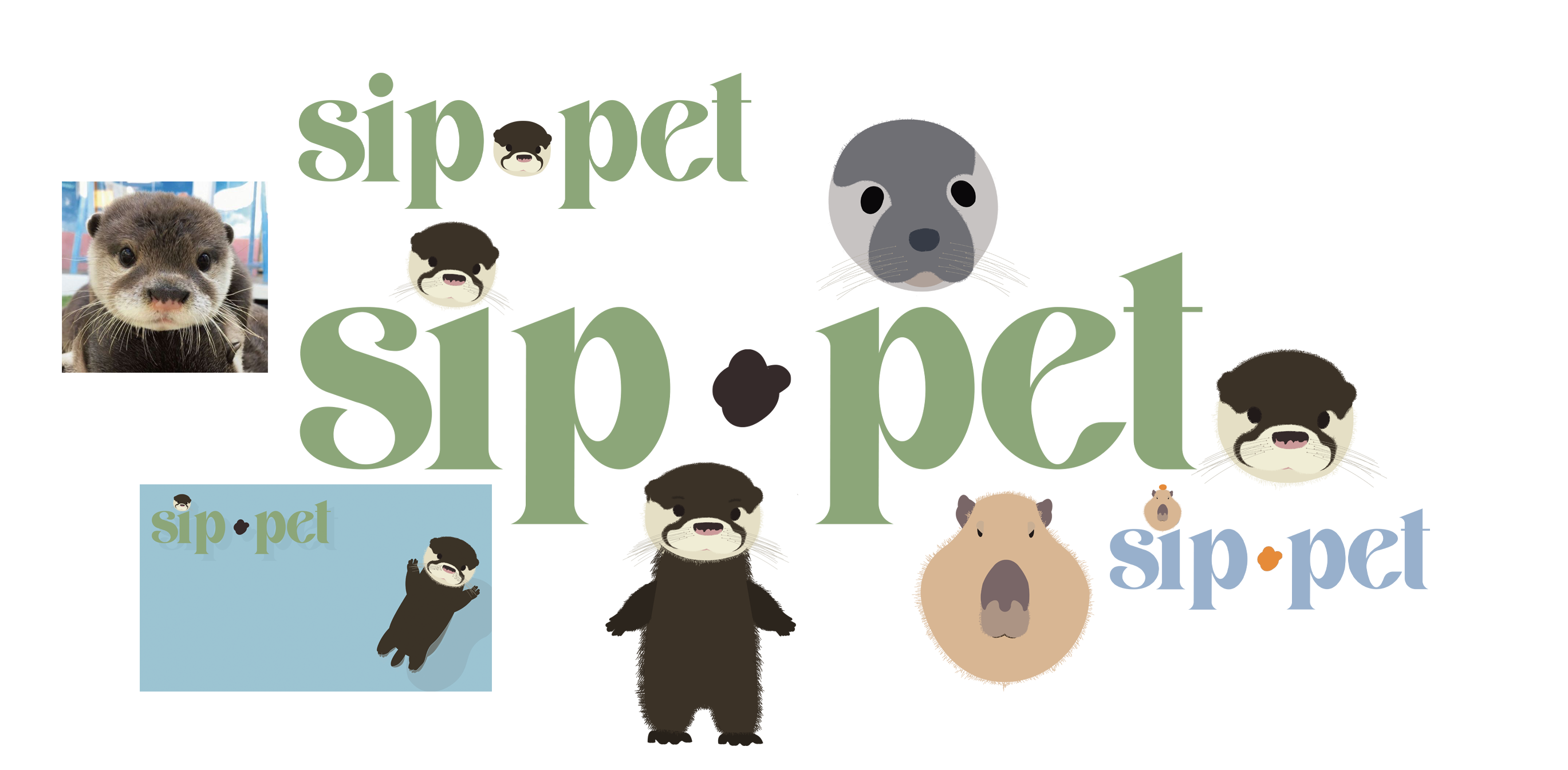
The brief of the project was to create a wearable or home automation device with some sort of gamification to go along with it and it must also help progress sustainable development goal 2, which is a world without hunger and malnutrition. I started the project by creating the logo, the logo design had to be sophisticated but have a playful touch to it. This was so it could appeal to both audiences. My teammate gave me the idea of splitting the words sip and pet with a dot I then placed the otter’s head as the dot for the i, this was a part of the playful element of the logo. I then played around with a handful of different fonts that had a sophisticated side to them and asked my team which one they all preferred. I showed the logo to people outside of my team and they suggested that I replace the dot for the otter. I listened to this feedback, tried it this way but the logo looked very simple and loses its playfulness that the team and I were going for. Next, I worked on the colour Palette for the brand/product. The colour palette needed to have a range of colours so we could stay gender neutral, I thought of doing basic rainbow colours and then muted these colours to appeal to our older audience. The brand guidelines were next on the list, they included what the product is, the logo, typography and the colour palette. After showing this to some people outside of the team, they suggested that I add more explanation to it so that anyone could read it and understand how the branding for the product works. I next worked some advertisement for the bottle with a digital design of the bottle. The last thing I worked on was a full body version and three emotions of the otter mascot I stuck to him being 2D because I did not have a of time to perfect a 3D version, after showing the designs to others, the feedback they gave me was to stick to a simpler look and to get rid of the fur. The outcomes are the best part about this project I would say this is because of my passion for this project and having the brand guidelines to guide me through the designing process. If I had the opportunity to do this project again I would have liked to organize my time a little more so I could design some more advertising.